BeVigilproduct design
livesince 2021bevigil.com
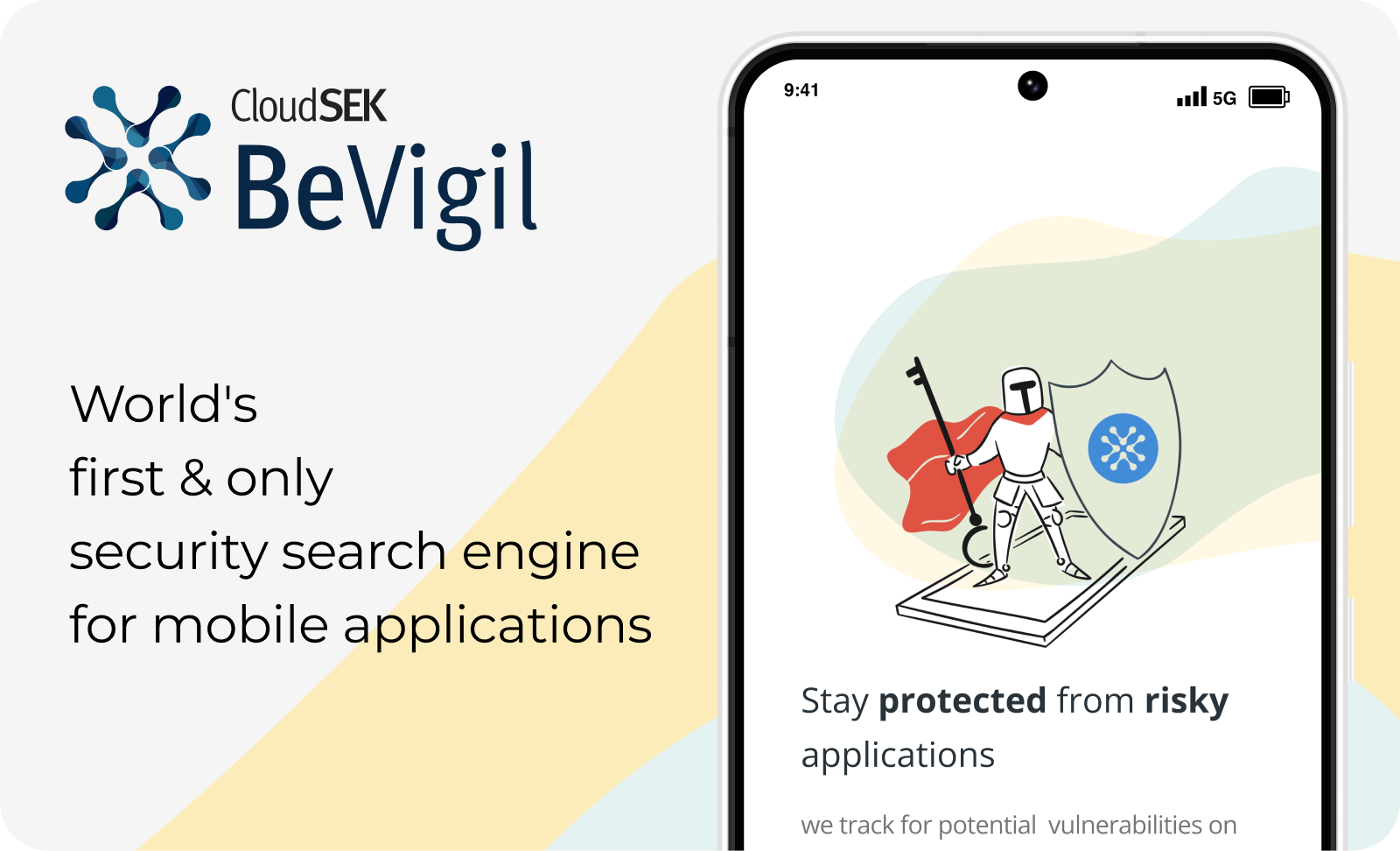
BeVigil is a search engine for mobile app security risks. I led its UX design in a core team of three: a product manager, a developer and me. The goal was to simplify mobile app security analysis, which had been fragmented, technical, and open only to experts. Users needed one place to assess an app’s risk quickly, find security data they could trust, and act on it.
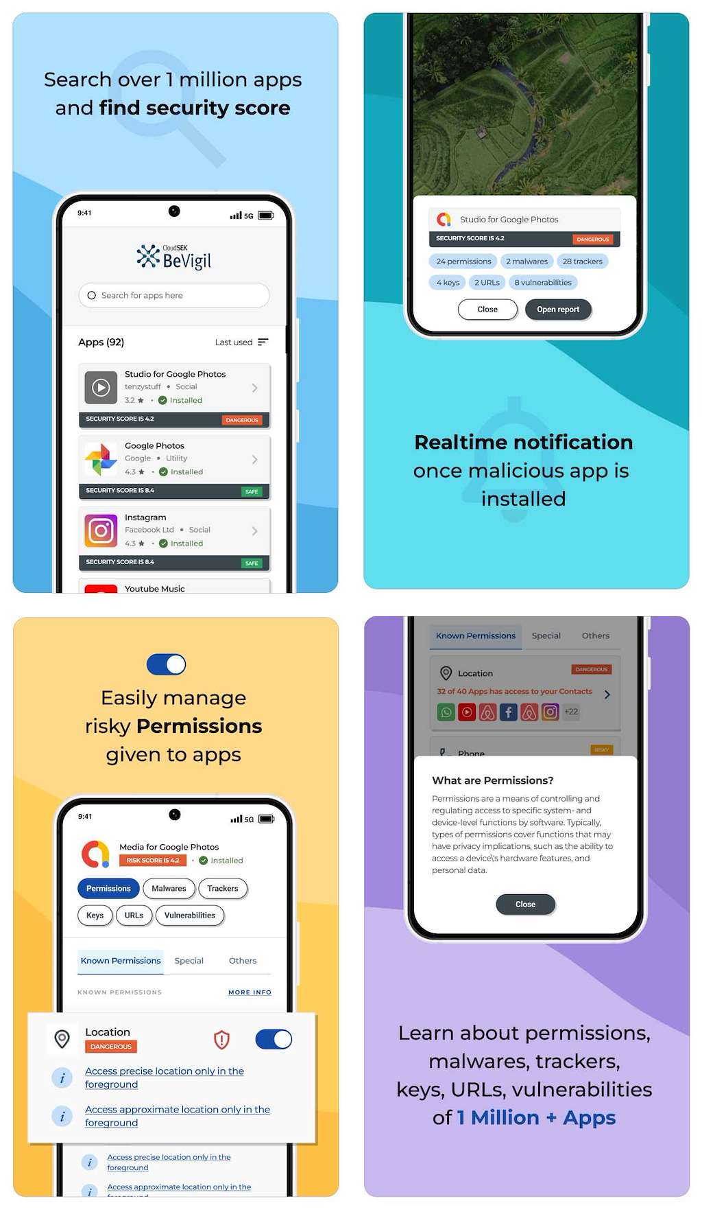
The design process
I worked closely with the PM to turn early product ideas and wireframes into high-fidelity screens. We started by mapping user journeys and setting up the information architecture, which gave our engineer a clear development roadmap. With weekly sprint planning, the three of us kept in close contact and iterated fast.
I designed contextual dashboards, search tools and app reports. Progressive disclosure and visual cues reduced the complexity while keeping the technical depth. A key challenge was the security vocabulary: I wrote simpler copy and contextual help so that people who are not security professionals could follow it, without losing accuracy.
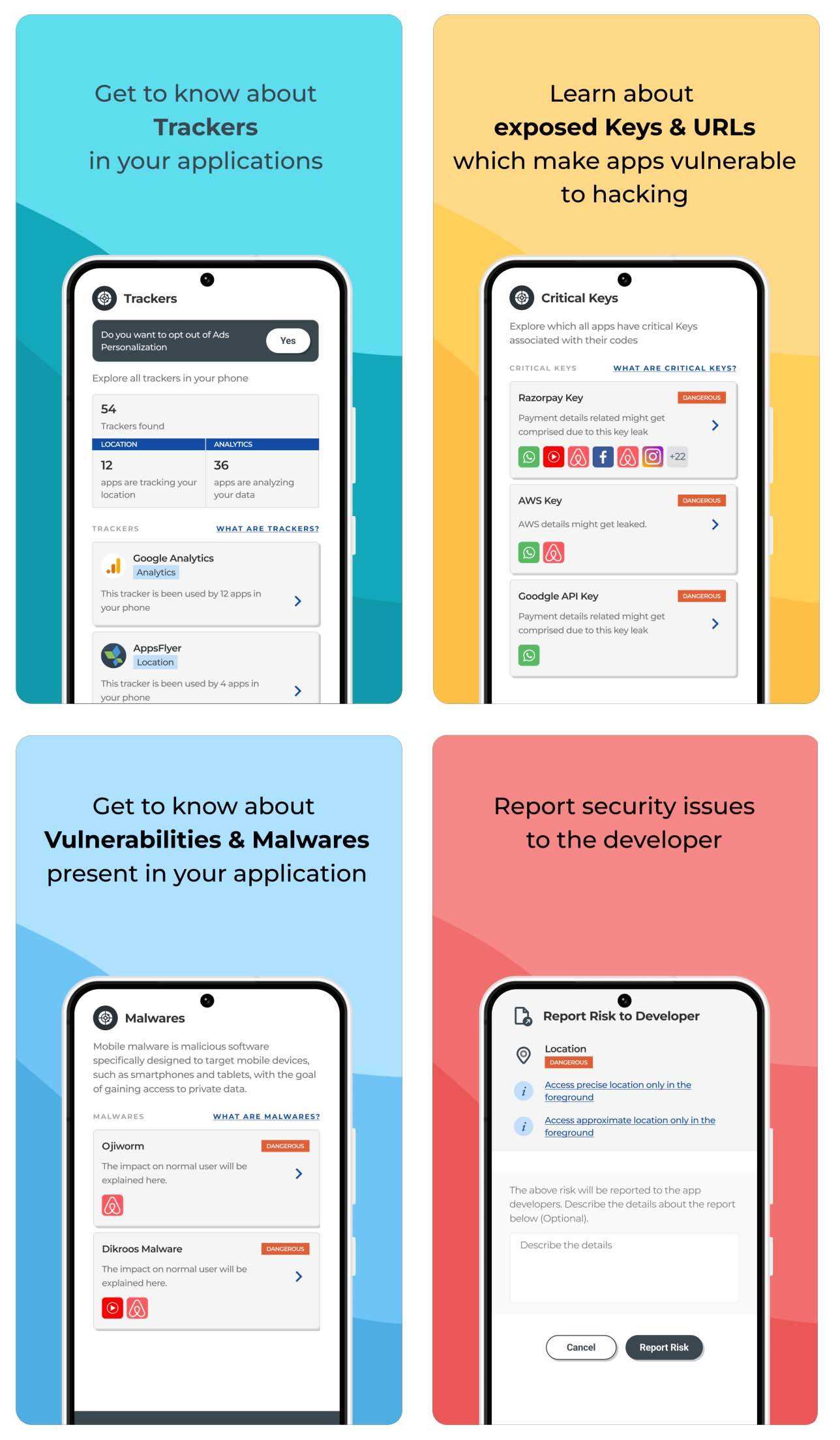
Motion
I wanted the interface to be engaging as well as usable. Motion was planned from the start and added near the final handoff as Lottie animations: a splash-screen logo animation, the onboarding walkthrough, a device-scan animation on the home screen, and small interactions. I drew the artwork in Adobe Illustrator and animated it in After Effects before exporting to Lottie. The motion made the experience clearer and more polished, and helped users trust it.
Results
Users cut their analysis time by 78%, got clearer insights faster, and praised the platform for making app security accessible. I owned the UX end to end, from strategy and wireframes to motion design and developer handoff, in a small cross-functional team.
Filed under product design